An aspiring artist and new vet's blog. Leave a comment or send us a note!
Thursday, April 05, 2007
Housing graphs
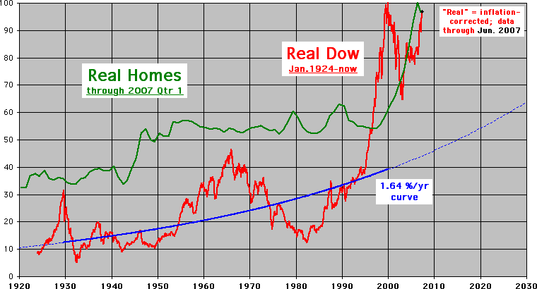
Speaking of graphs, check out this highly unnerving video of the US housing market graphed by roller coaster tycoon. This is all from speculativebubble.com. Im not quite sure what to think of it, except to take it as a bit of caution. Also, housing has only doubled in value? (adjusted to inflation) I found another such graph of the DOW since the 20's and it makes housing look conservative! So are we doomed or is this the way things run now. Anyway, try to enjoy the ride!
(Here is the graph they used)
(The DOW and housing since 1920 adjusted for inflation)

No comments:
Post a Comment